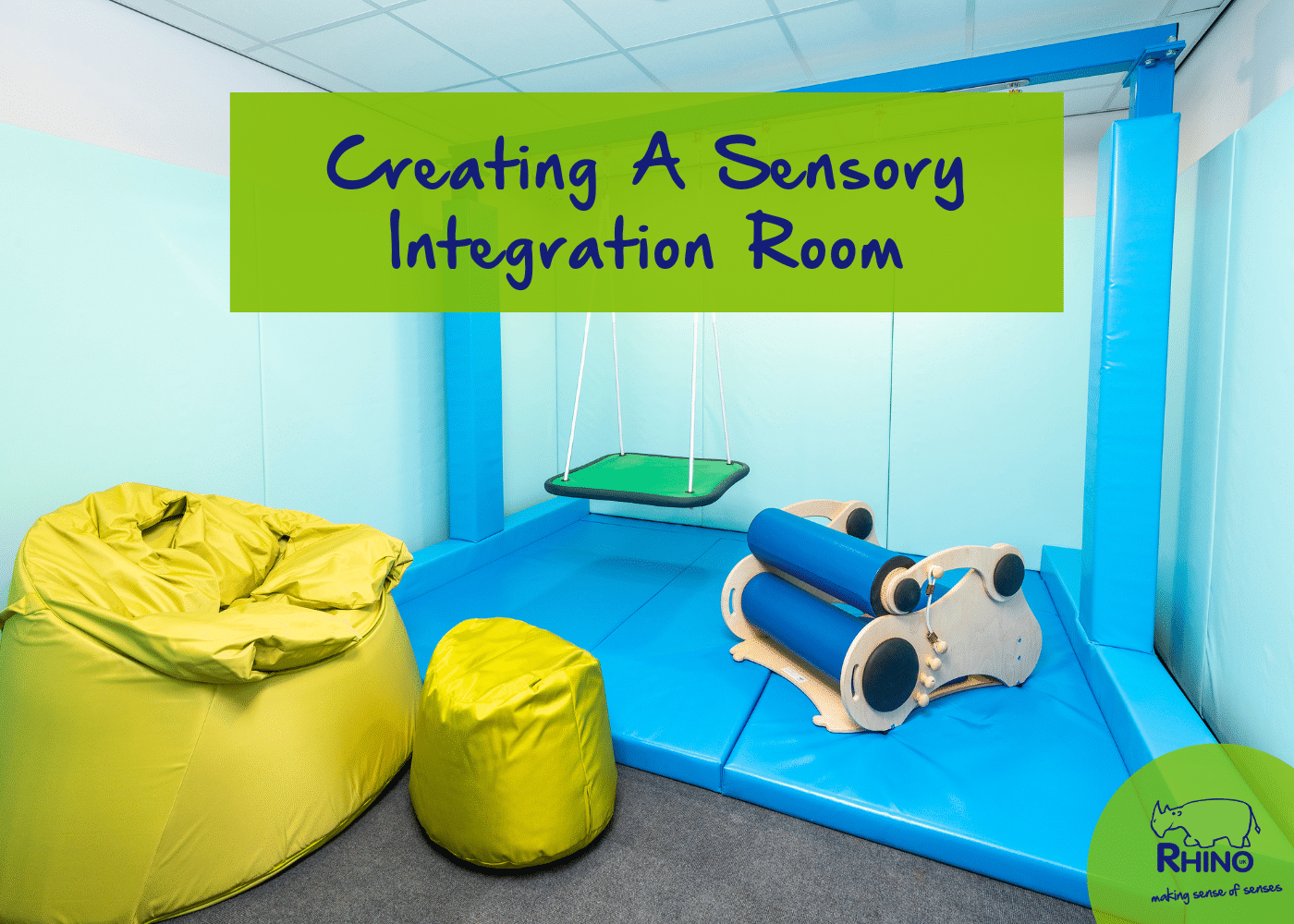
Sensory Rooms are neutral spaces designed to calm a user’s mind and body.
They’re typically used when someone is feeling overstimulated or anxious, as the room’s calming features help to reduce the risk of a meltdown or an anxiety attack; because of this, Sensory Rooms are beneficial in schools, hospitals and public spaces that are typically loud, busy, and overwhelming.
Neutrality is a key aspect of a sensory room. Not in a chic Swedish minimalistic design sense. But in the sense that your space can act as a blank canvas for any user to quickly transform into their own colourfully comforting sensory environment. A neutrally designed Multi-Sensory Room allows anyone to create their own personalised, immersive sensory environment. Whilst one user might like a dark space that’s great for focusing on a bubble tube’s changing colours, another might prefer a brighter space filled with natural light so that they can connect their senses to nature.
Our Sensory Design Team has put together a list of 5 Sensory Room Decoration Tips for you to follow – they’re simple and will help you create an inclusive sensory space.
5 Sensory Room Decoration Tips
1. Colours can be overstimulating. Keep it simple
There’s a good reason why you wouldn’t paint your bedroom a lively lime green; it’s not the most soothing colour to help us relax before a night’s sleep.
This same logic should be applied to your sensory space.
We’d recommend using cool and neutral colours to decorate the walls of your sensory room. However, if you’d like to add a splash of colour, keep it simple and natural with a calm duck egg blue or a soft sage green.
2. White-ish is best for light effects
White-ish, plain-coloured walls are the best for projection and light effects as they reflect their wonderful colours and patterns without augmenting any sensory magic.
The plain walls also create a brilliant blank canvas for you to create a personal sensory experience. Project, reflect and create imagination portals around the room and design a personal immersive sensory world.
3. Why white-ish and not white?
Bright white colours can be overstimulating for people with sensory processing difficulties. White paint is excellent at reflecting light, making a sensory room too bright and overstimulating.
Whitewashed walls can also feel imposing, sterile, and scary – far from the warm comfort your sensory room should bring.
4. Keep the floors dark
We’d recommend darker-coloured carpets to cover the floor of your sensory space as they’re less likely to show marks.
Darker floors are also great for making sensory spaces more inclusive for people with visual impairments; the contrast between a dark floor and a light wall helps them map out their environment better, so they can safely explore their senses.
5. Dark Colours for Dark Rooms
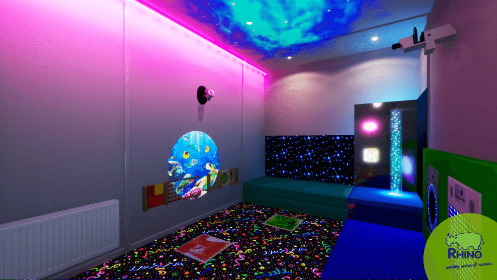
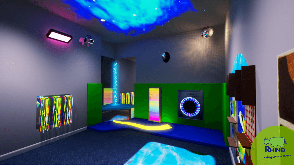
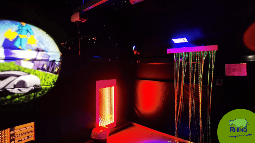
If you want to create a special Dark Room, we’d recommend using dark colours on the walls to enhance the room’s sensory experience. For example, dark blue walls could quickly become galaxies filled with stars and relaxing dreams. Whilst dark green walls could become a hidden forest perfect for nature explorers.
Now you should be ready to start preparing your sensory space decoration plans. But before you do that, make sure you avoid these sensory room design mistakes!
What you should avoid when it comes to decorating your Sensory Room
- Stimulating colours: Red, Orange, Yellow and bright neon shades – your sensory room needs a neutral, cool, and calm aesthetic.
- Fluorescent lighting: Bright fluorescent lighting can be particularly overstimulating and disorienting for those with visual sensitivities, even going so far as triggering meltdowns and migraines. Try to make the most of natural lighting.
- Patterns: Wallpaper, murals, and patterns will distract room users. They’re fun in soft play environments, but it’s best to keep it simple if you want to create a therapeutic sensory room.
Our key Sensory Room Decoration takeaway: Remember to think practically and with your senses instead of creating an insta-perfect space.
If you’d like more room advice, don’t hesitate to get in touch with a member of our sensory design team – who will be more than happy to help.
Did you know that our installation team offer complete room redecoration services? Get in touch if you’d like to find out more.
Sensory Room Colour Guide
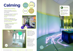
Download our free Sensory Room Colour Guide today to inspire your next sensory project.